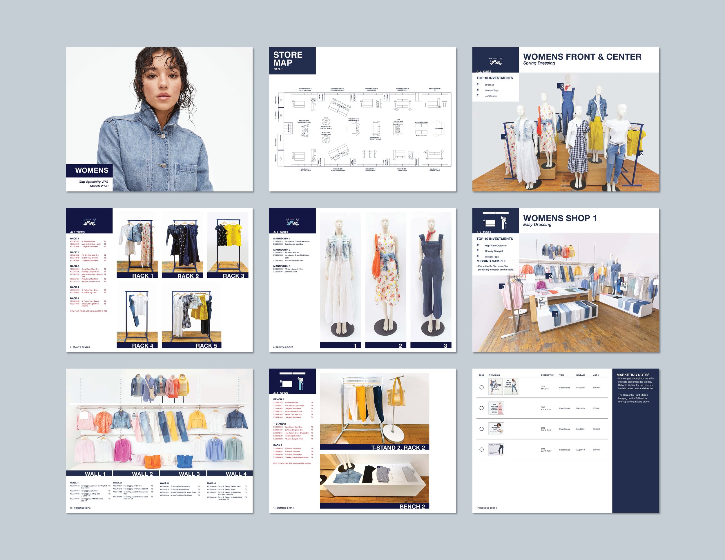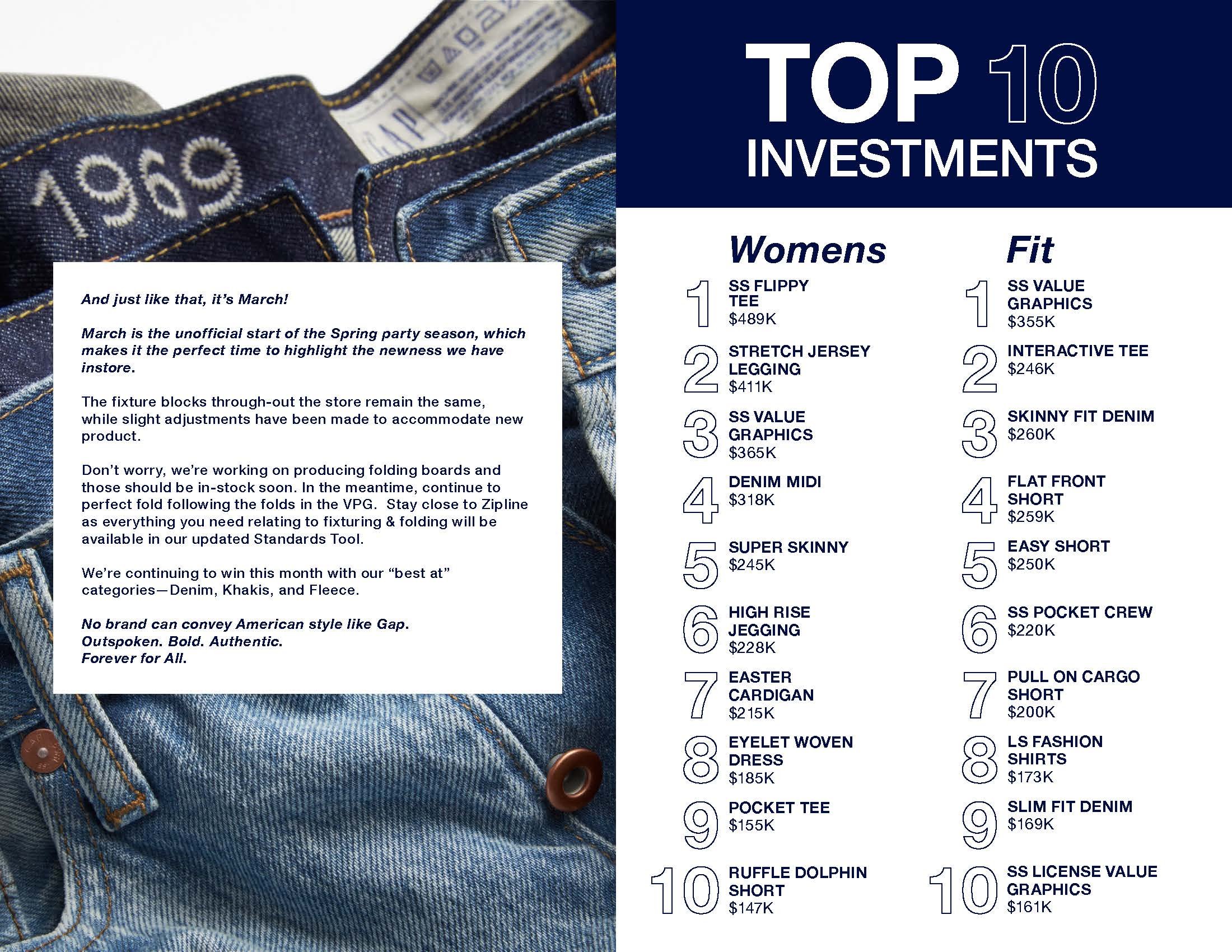
Gap Visual Presentation Guide
I redesigned the template for the Specialty Visual Presentation Guide to make it easier to read and more on brand. I updated the typefaces used in the book to coordinate with the in-store and windows marketing. I also made the opening few pages of information more graphic and eye-catching to make sure that store associates would read the information. I simplified the color palette to Gap Blue and white. In order to create the book each month, I photographed the floor set in the studio space, then edited the photos and clothing listing, and placed both into the visual directive book layout. Once the book was complete, it was routed to the Visual Merchandising and Marketing teams to make edits before being uploaded to the Store Portal for distribution.